Visual identity for the Pilecki Institute
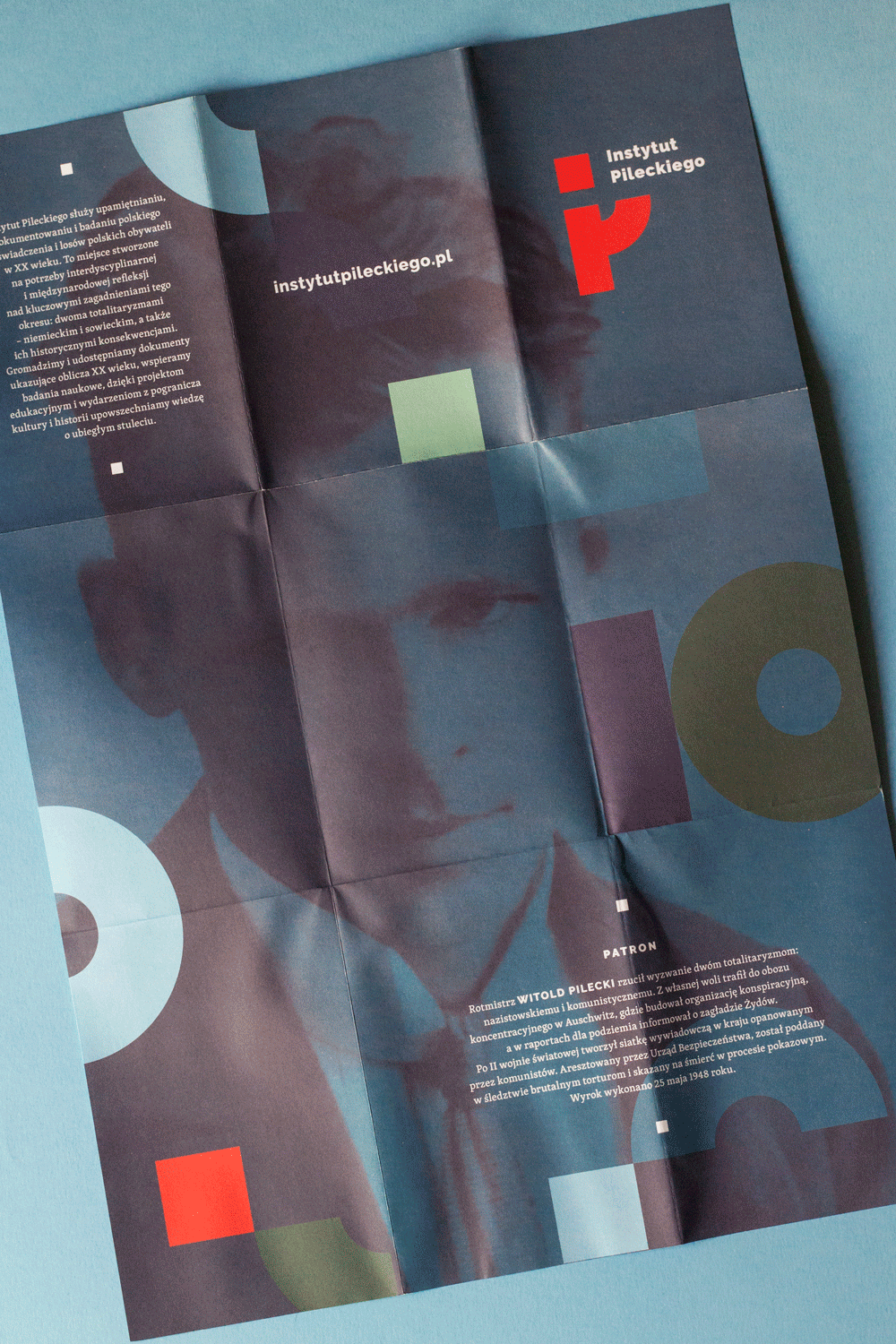
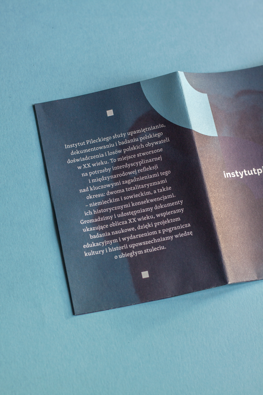
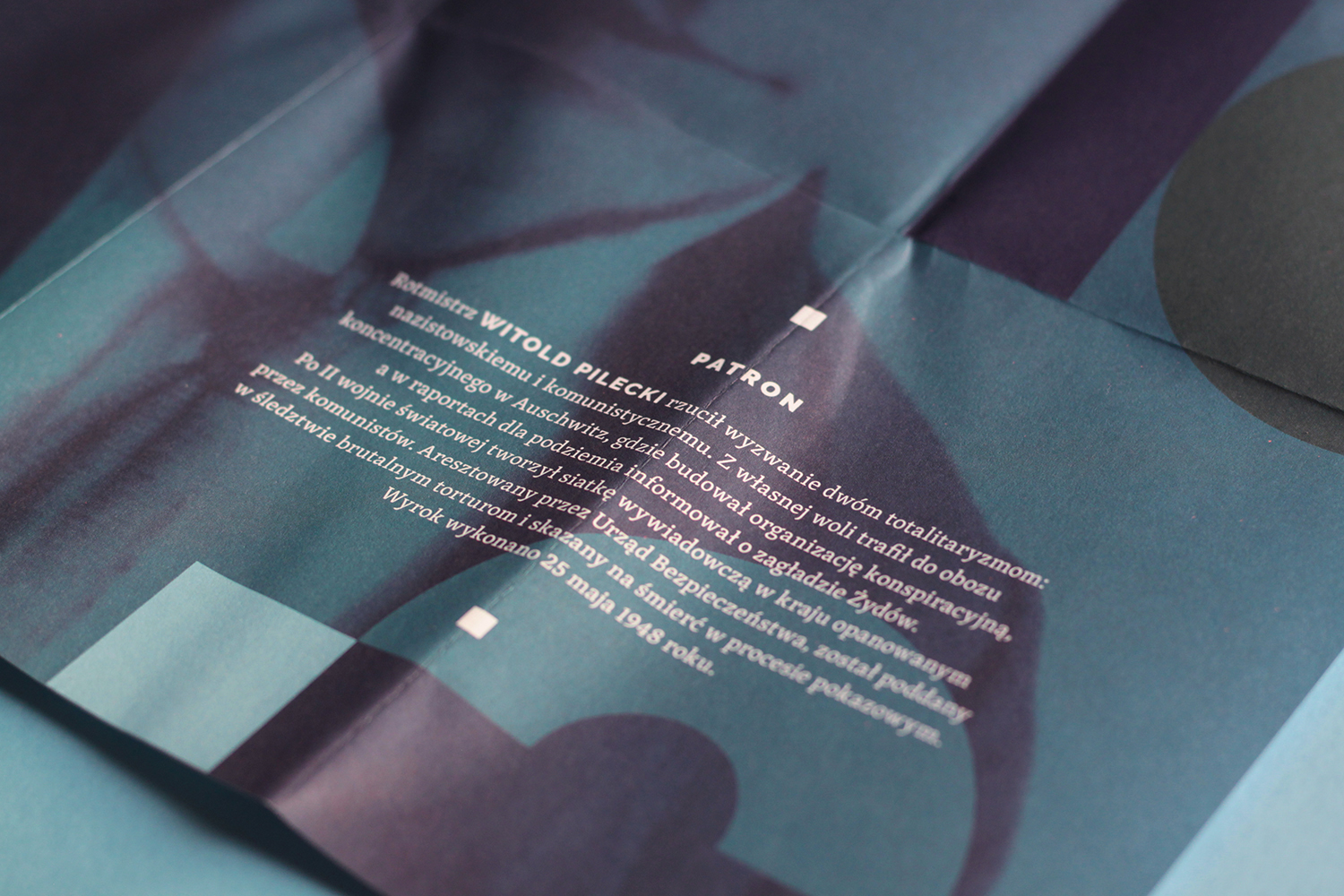
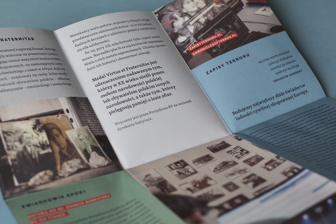
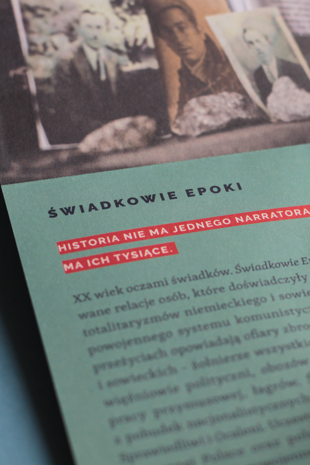
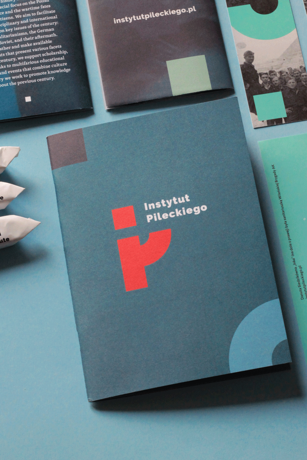
The Pilecki Institute is a scientific research institution focused on the history of 20th century’s totalitarian regimes. The Institute promotes knowledge about the past century through gathering and publicising documents, as well as organising educational projects and events that combine culture and history.
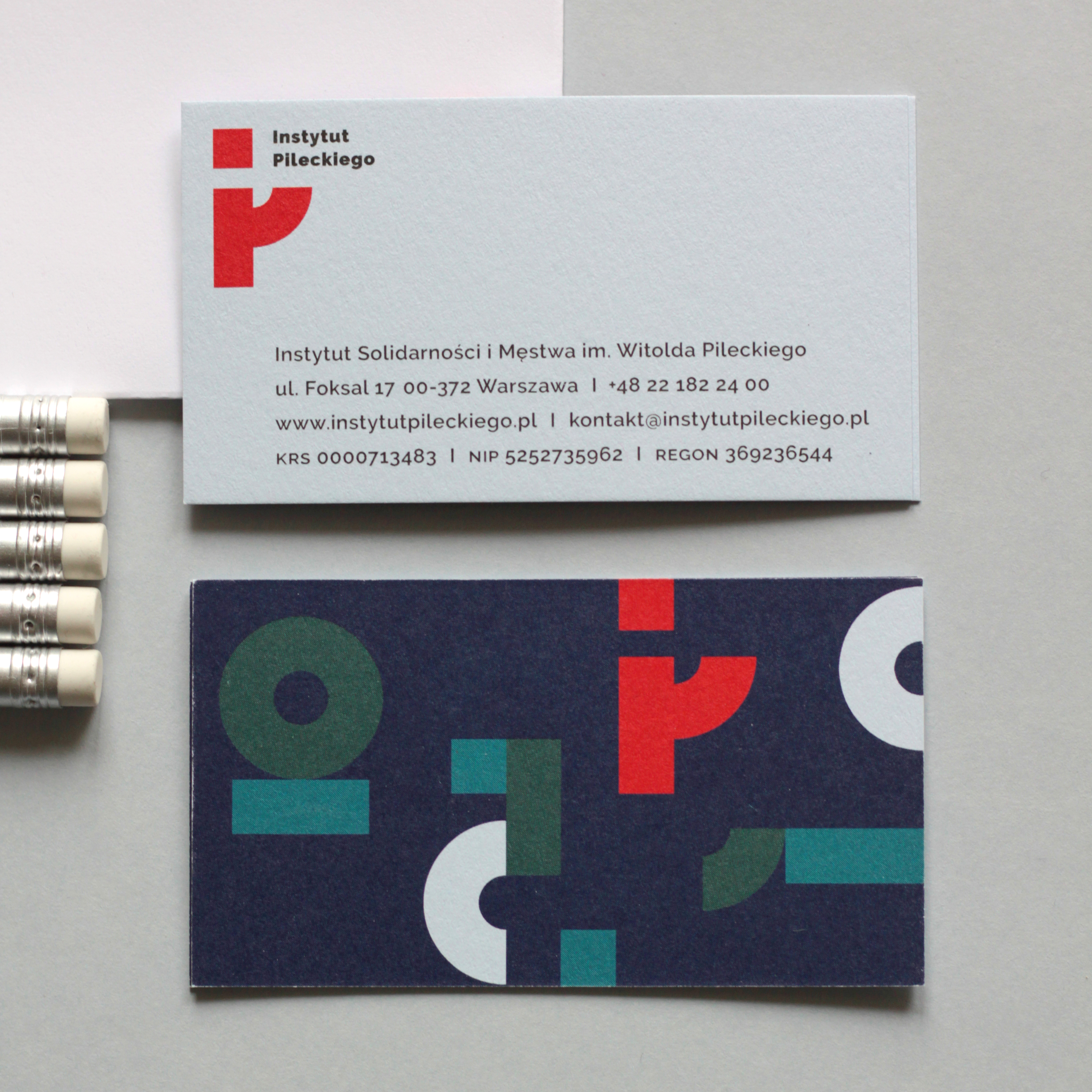
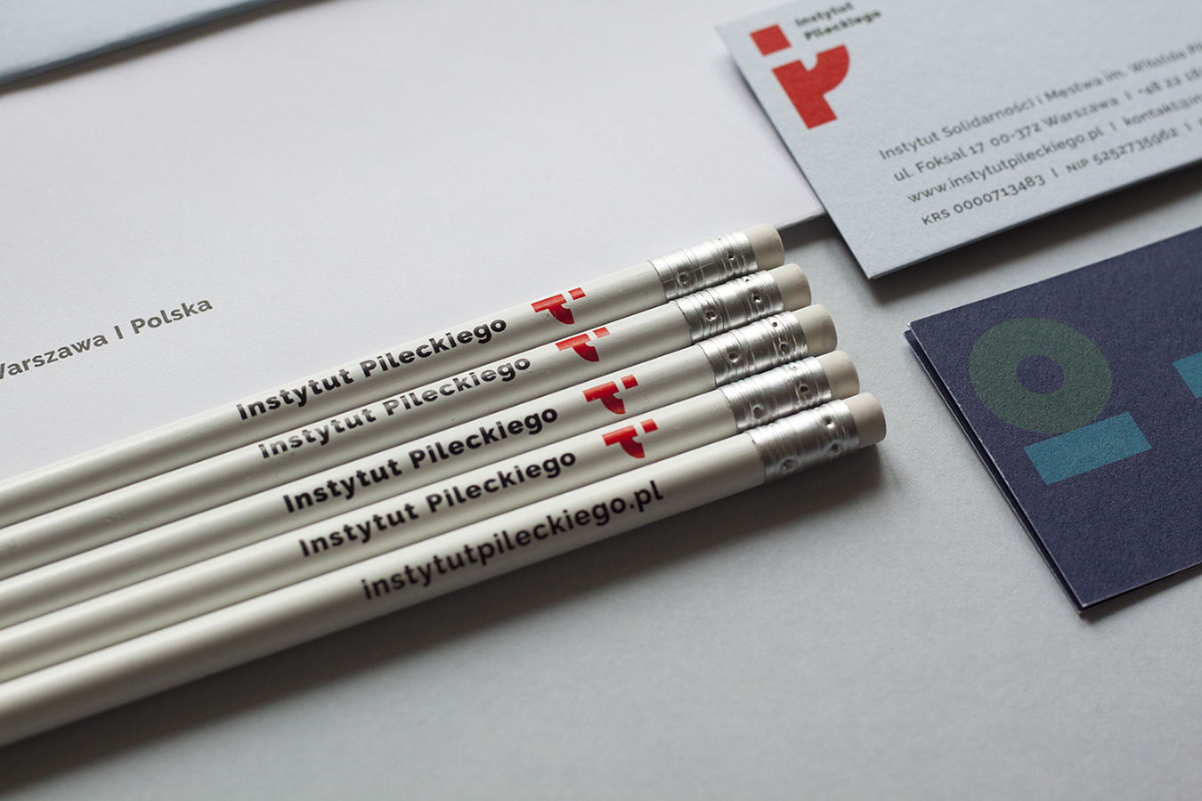
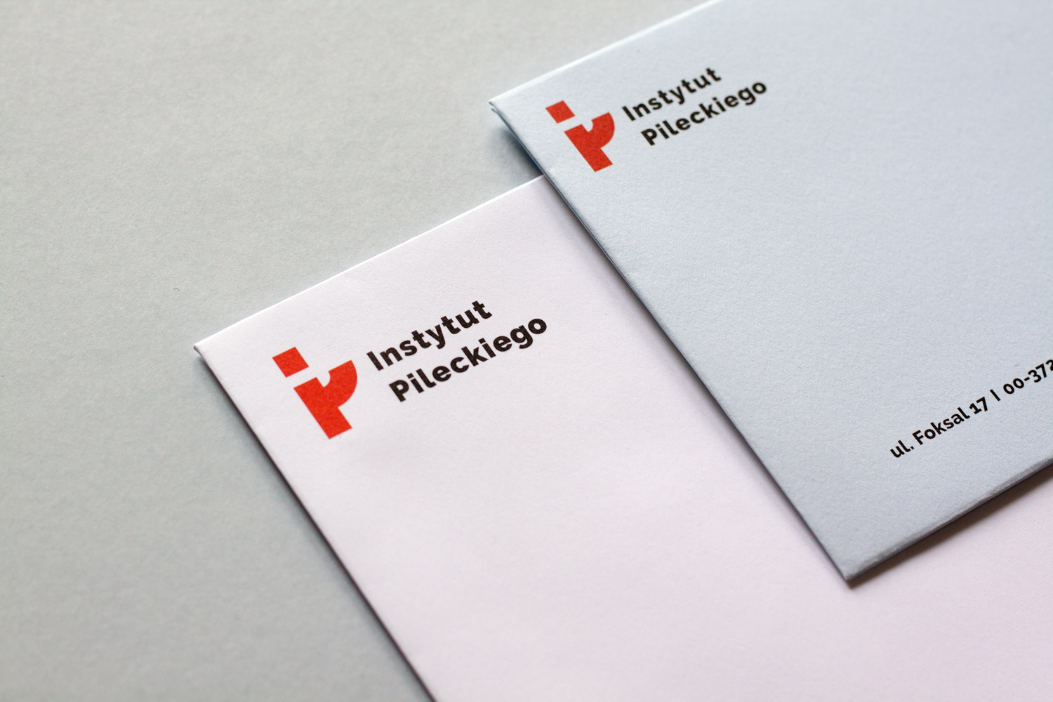
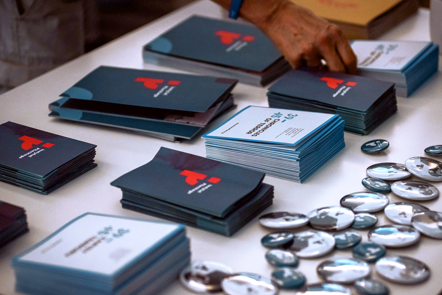
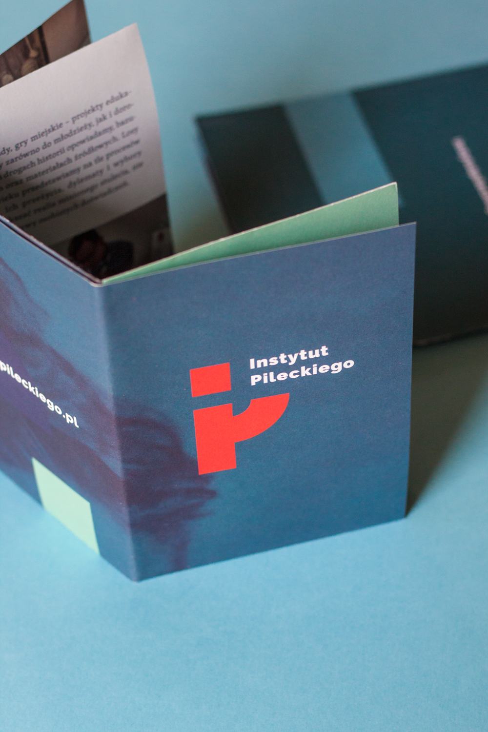
My design of the mark was chosen in a contest. Based on it, I designed a comprehensive visual identity which the Institute has been using since 2018. The contest task was to create an image of a modern institution that aims at speaking plainly about difficult history.
The mark consists of the PI initials and the logotype; it has a flexible structure. Several variants were created, which allows the mark to be used in various contexts and to adapt into languages different from Polish.
I designed the stationery, business cards for employees, and gadgets for attendees of conferences and other events: notepads, folders, pencils, and pens. The modular shapes used in the printed materials refer to the logo and contribute to the Institution’s consistent visual language.
For the printed materials, I chose uncoated paper, which harmonises with the historical character of the Institute. The colours of the paper were carefully chosen to match the colour theme of the identity.
The vivid colours used in the identity emphasise the openness of the Institution, whose programmes and projects are aimed at the general public. A series of materials was produced to promote the Institute’s activities: a flyer-poster, magnets, a pamphlet, pins, and bookmarks.
One important target group of the PI’s educational projects are the youth, which is why the visual style is designed to appeal to the younger viewer.
Most of the archival photos used in the promotional materials are intimate family portraits. This aims at familiarising the viewer with the realities of life in the past century and emphasising the importance of the individual perspective in discussing history.
Publishing is an important part of the Institute’s activity. The compact PI mark works well on the spines of books published by Institute.
Roll-up banners and wall displays were designed for events and conferences. I also designed graphic templates for posts published regularly on the Institute’s Facebook page.
client The Witold Pilecki Institute of Solidarity and Valor
design Agnieszka Prus
years 2018–2019
event photos IP
brochures printed by Argraf
papers Olin, Keaykolour, Color Style